
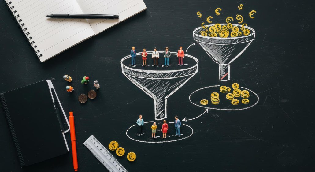
Why is CRO key to growing your online business?
In the dynamic world of e-commerce, success is not defined by the number of visitors who come to your website. The real value lies in how many of those visitors convert into paying customers. This is where Conversion Rate Optimization (CRO) comes into play. CRO isn’t just a buzzword; it’s a systematic approach that allows you to get more out of your existing traffic without having to increase your marketing budget. Imagine that 10,000 people a month visit your online store and your conversion rate is 1%. That means 100 orders. However, if you were to increase your conversion rate to just 2% with CRO, suddenly you have 200 orders – all with the same number of visitors! Studies show that e-commerce stores that regularly optimize conversion rate achieve an average of 30% higher sales compared to competitors that don’t engage in CRO. In this article, we’ll dive into seven key strategies to help you convert more visitors into loyal customers and maximize your ROI.
1. Page load speed: the cornerstone of user satisfaction
In this day and age, when users’ attention spans are more scarce than ever, the loading speed of your website is absolutely critical. Modern online shoppers expect instant response and are not willing to wait. Imagine walking into a brick-and-mortar store and having to wait a minute for the door to open. You would probably walk out. It’s the same in the online environment. Google research shows that up to 40% of visitors will leave a website that takes longer than 3 seconds to load. Even more alarmingly, each additional second of loading time can reduce your conversion rate by up to 7%. For e-tailers, this means a direct loss in sales. Fast page load times are especially important for mobile users, who often access your online store over slower mobile connections. Optimising loading speed not only improves the user experience and reduces immediate page abandonment rates, but it also has a positive impact on SEO as Google prefers faster sites in search results. Your investment in speed optimization will pay you back many times over in the form of higher conversions and happier customers.
2. Clear and actionable calls to action (CTA).
A Call to Action, or CTA, is the bridge between browsing and buying. It’s a clear instruction that tells the visitor what to do next. Whether it’s a “Buy Now”, “Add to Cart”, “Subscribe to Newsletter” or “Contact Us” button, every page of your e-commerce store should contain at least one clear and visible CTA. Even seemingly “dead” pages, such as 404 error pages or search results pages with no items found, are opportunities to direct users to useful content. For example, on a 404 page, you can offer a CTA to “Go to the homepage” or “View our best-selling products.” The key to an effective CTA is its wording. Research shows that calls to action that begin with verbs (imperatives) and include a time stamp (e.g., “Shop Now,” “Get a discount today”) are much more effective and can increase conversion rates by up to 90% compared to neutral descriptions like “Learn More.” Make sure your CTAs are visually distinctive, easy to click, and clearly communicate the next step for your customer.
3. Intuitive clickable elements and micro-animations: improve the user experience
A smooth and seamless interaction with your e-shop is essential for a positive user experience. This includes how easily users recognize and interact with clickable elements. Buttons, links and other interactive elements should be clearly recognisable – whether through hover effects (changing colour or shape as the mouse moves over), rounded corners, subtle shadows or traditional blue underlined links. If a user clicks on an element that looks clickable but nothing happens, it leads to frustration and reduces trust in the user interface. It is equally important to ensure there is enough space between actionable elements to avoid unwanted clicks, especially on mobile devices. UI studies recommend a minimum touch element size of 44×44 pixels with sufficient spacing. In addition, subtle micro-animations, such as the pulsing of the main CTA, can effectively draw the user’s attention to the most important elements of the page without distraction. The human eye is naturally drawn to motion, which can be used to direct attention to the main call to action. The key is to keep these animations subtle and unobtrusive so that they don’t appear distracting.
4. Efficient handling of cookies and pop-ups: respect the customer’s attention
Cookie notification bars and pop-ups are a common part of modern websites, but their implementation can significantly impact user experience and conversion rates. Cookie notifications are necessary due to legislation (GDPR) but should not interfere with the first impression. Make sure that the cookie bar can be closed or acknowledged quickly and easily (ideally within 2 seconds). Complicated or annoying notifications can put visitors off on first contact. Similarly with pop-ups. While they can be an effective tool for acquiring email leads or promoting special offers, their timing is key. Displaying a pop-up immediately after arriving on a page or before the user has a chance to explore the content leads to high abandonment rates. Ideally, pop-ups should only be displayed after a certain amount of time on the page, after a few pages have been viewed, or when exit intent pop-ups are signalled. Properly timed pop-ups can increase conversion rates, while poorly timed ones can drastically decrease them. Respect your customer’s attention and offer value at the right moment.
5. Wishlists: a low-threshold step towards future purchases
Wishlists are an often underestimated but extremely effective tool for keeping customer interest and building long-term relationships. They allow users to save products they are interested in without having to make an immediate purchase. It’s a low-threshold action that doesn’t require a large commitment, but keeps the user engaged with your e-store. It’s a convenient way for the customer to remember the products they’re interested in and come back to them later. For you as the e-shop owner, wishlists provide valuable data about customer interests. You can then use this data in your email marketing – for example, to send an alert about a discount on a product from a wishlist, or to remind a customer that they have products on their wishlist that might be of interest to them. Implementing wishlists can lower the barrier to first interaction with your e-commerce store, increase user bounce rates, and open the door for targeted marketing, which ultimately leads to higher conversions.
6. Upselling and cross-selling.
Upselling (offering a more expensive or better product) and cross-selling (offering related products) are proven strategies to increase Average Order Value (AOV). The key is to make the process as smooth and non-violent as possible for the customer. The ideal place for upselling and cross-selling is the space between the cart page and the thank you page after the order is completed. If a customer accepts an offer for an additional product, they should not be forced to go through the whole process of entering payment details again. This would significantly increase the likelihood that they will not complete the order. Instead, the additional product should simply be added to the existing order with a minimal number of clicks. An example might be offering an extended warranty when purchasing electronics, or recommending related accessories (e.g., a phone case) after adding a phone to the cart. Properly implemented upselling and cross-selling strategies can significantly increase your sales without the additional cost of acquiring a new customer because you’re targeting existing, motivated buyers.
7. Optimizing navigation: the path to a seamless shopping experience
Navigation is the backbone of every e-shop. If customers can’t navigate easily, they will quickly lose patience and leave your site. The key is a wide and shallow navigation structure – that means lots of items on one menu level instead of a deep menu with many levels. The goal is for the customer to get to any product in no more than 3 clicks from the homepage. Each additional click reduces the likelihood of the user completing their journey. Navigational feedback is also important, such as highlighting the active menu item or displaying breadcrumbs so that the customer always knows where they are on the page. Category labels need to be precise and concise so that the customer immediately understands what content can be found under that category. Avoid unnecessary links in the main navigation (e.g. privacy policy) that detract from the products; this information belongs in the footer. Finally, consider implementing a sticky navigation that remains visible even when scrolling down, ensuring constant access to main navigation elements such as categories, search, and cart. Smooth and intuitive navigation is essential for a positive user experience and higher conversions.
Turn visitors into loyal customers
Conversion rate optimization is not a one-time task, but a continuous process of testing, analysis and improvement. By implementing these seven key strategies – from speeding up page loads, to optimizing CTAs and navigation, to making smart use of wishlists and upselling – you can dramatically improve your store’s user experience and convert more visitors into paying and loyal customers. Remember, even small changes can yield big results. Start with one or two points that you think have the most potential for your particular e-shop, and gradually implement others. Measure your results and continually learn from the data.